The Standout block allows a content creator to draw attention to important content. For example, the Standout block can feature a case study, prompt learner action, identify objectives, highlight required reading, or provide a useful tip. The block is informational only and is not graded.
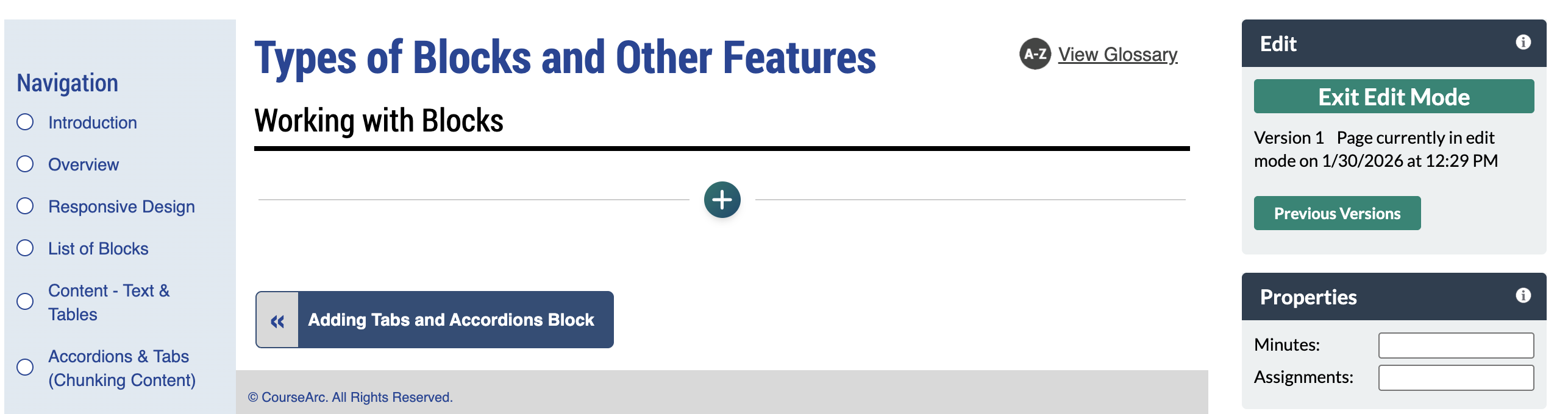
- Navigate to the page and select Edit this Page. Find the position you want to add a block and select the plus (+) icon.
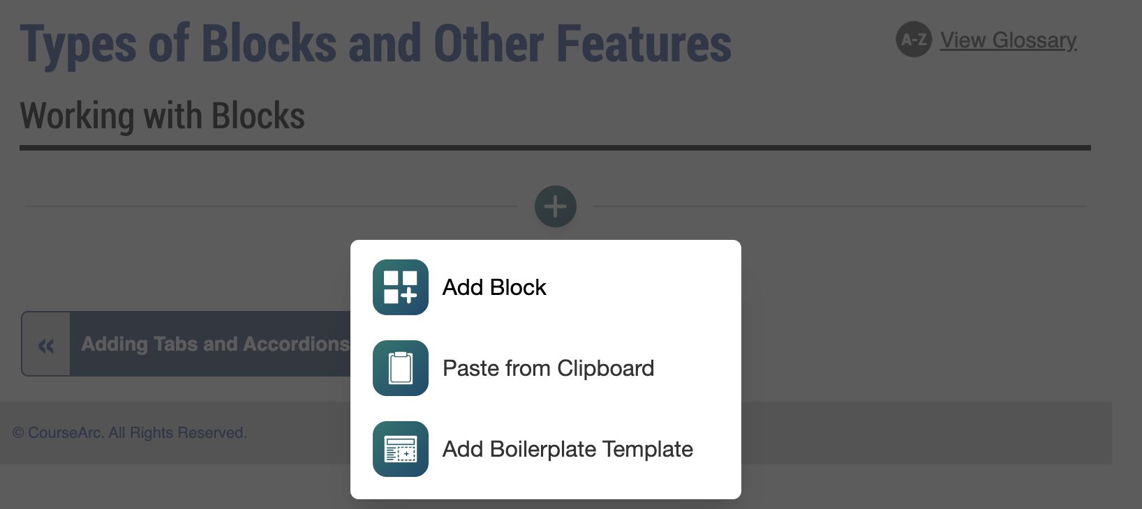
- From the dropdown, select Add Block.
- In the Add Block modal, you can either:
- Use the Search field to find a block by keyword
- Select a block from your custom list of Favorites
- Scroll through the list of All Blocks to select one
- Use the various categories in the side panel to filter by block type
- Select the star icon to add or remove blocks in your Favorites list
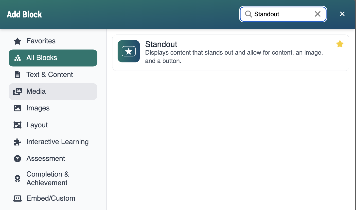
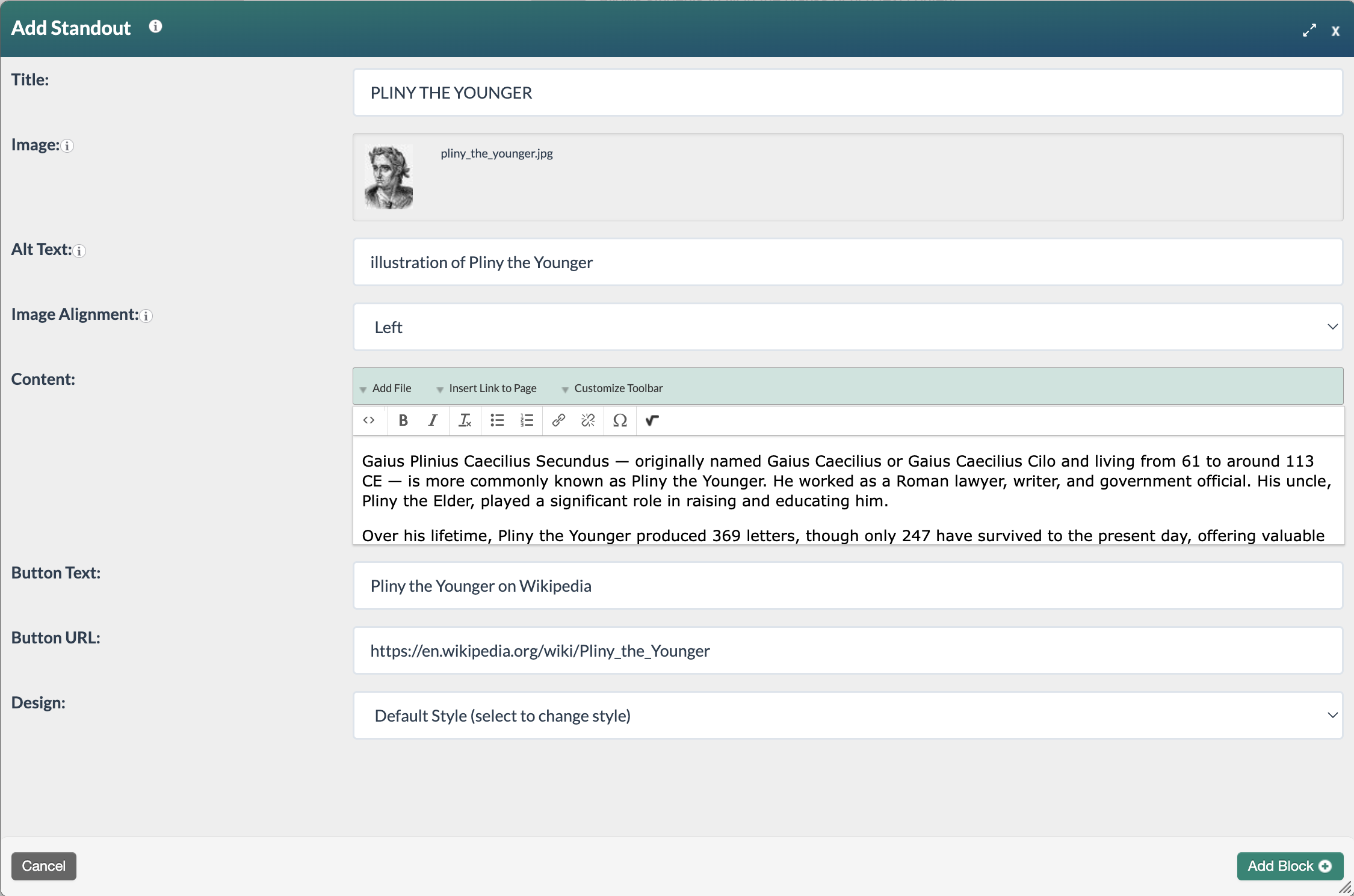
- Select the Standout block. The Add Standout form will open. Complete the following fields:
- Title: Enter a title for the Standout block. The title is displayed at the top of the Standout block. The title is limited to 50 characters and is used to identify individual slides in the Manage Slides section—it is not displayed to learners.
- Image: Click the field to add an image from the File Manager.
- Alt Text: Describe the content and function of the image using as few words as possible. Alternative text may contain up to 255 characters. Alt text is read by screen readers, allowing the content and function of an image to be accessible to those with visual or certain cognitive disabilities. To learn more about alt text, visit WebAIM's Alternative Text.
- Image Alignment: Select left, right, or center to position the image within the block.
- Content: Use the text editor to enter and format the text that should display in the block.
- Button text: If the Standout block should link to additional content, enter the text that should appear on the button.
- Button URL: If linking to additional content, enter the corresponding URL.
- Design: Select your design option from the dropdown menu.
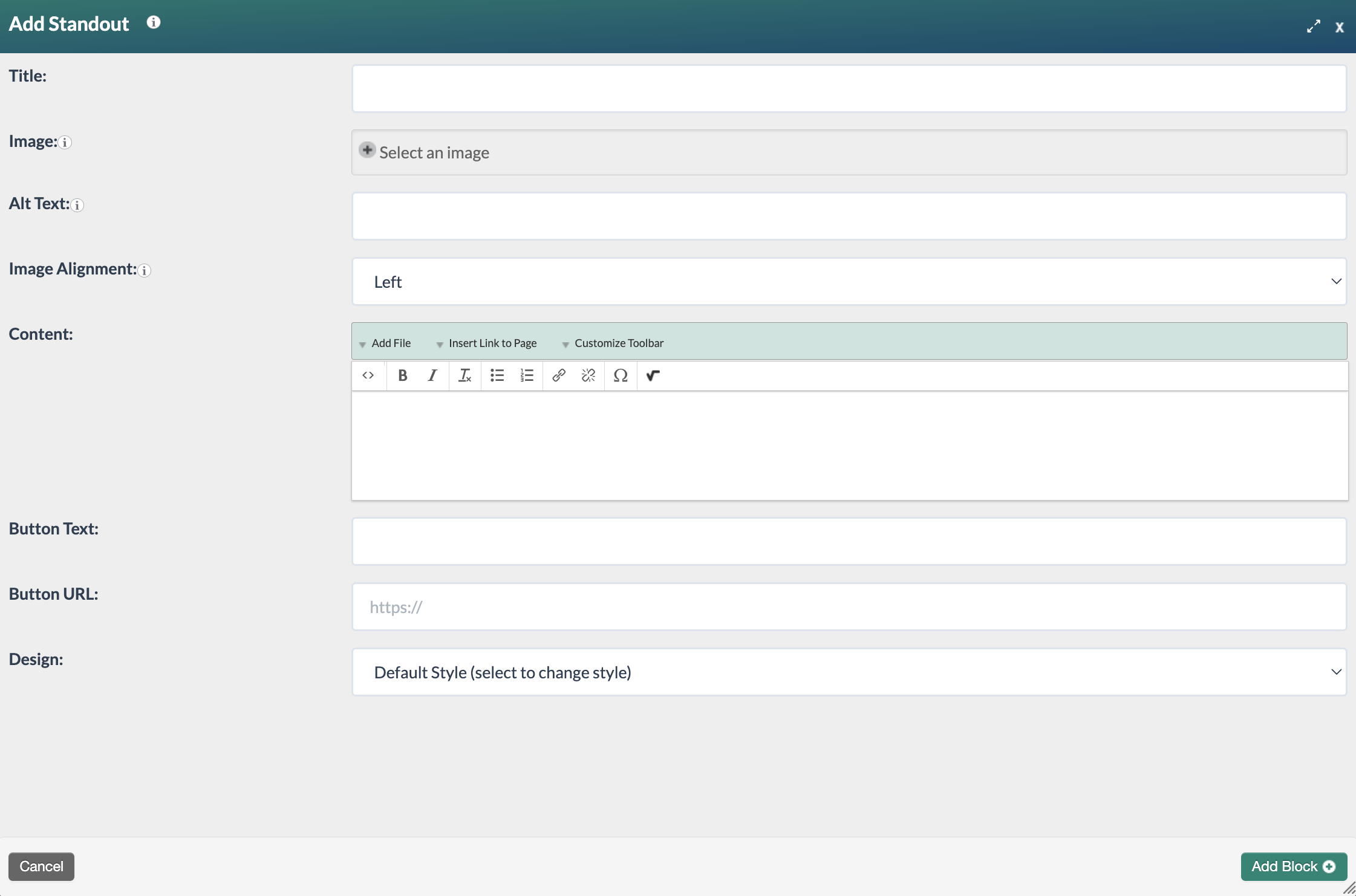
- Once you have completed the form, select the Add Block+ button to save the block to the page.
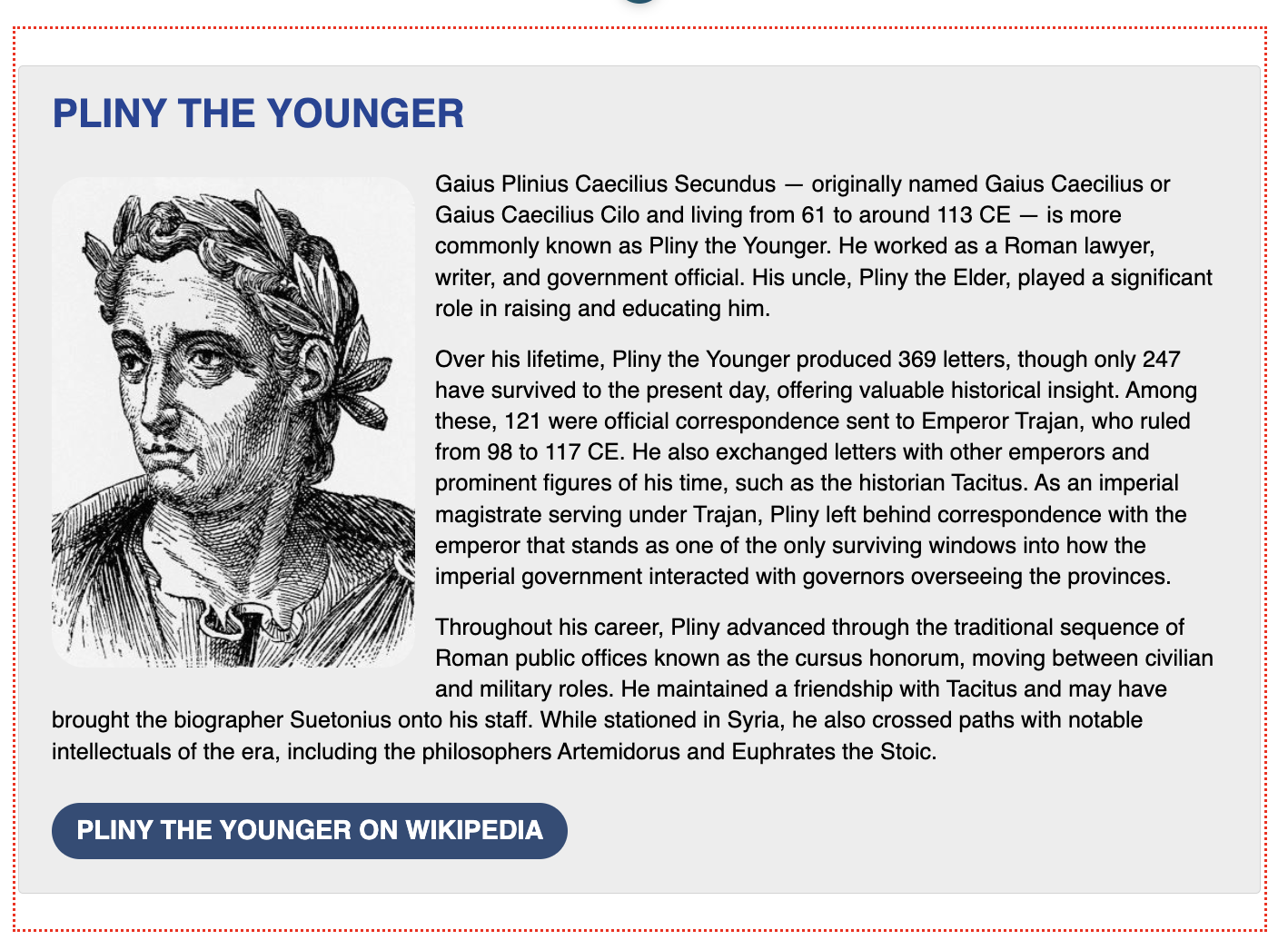
- The new block will appear on the page in Edit Mode with a red, dotted outline indicating it's editable.
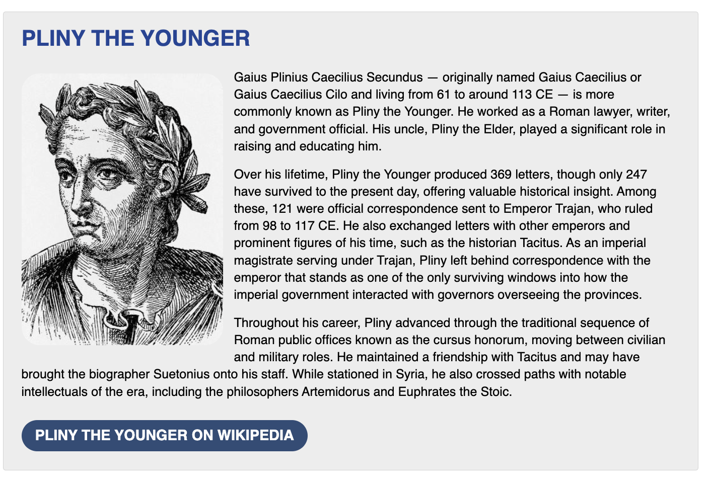
- Select the Publish My Edits button to save the block to the course page and see the content as it will appear to learners.
Design Options
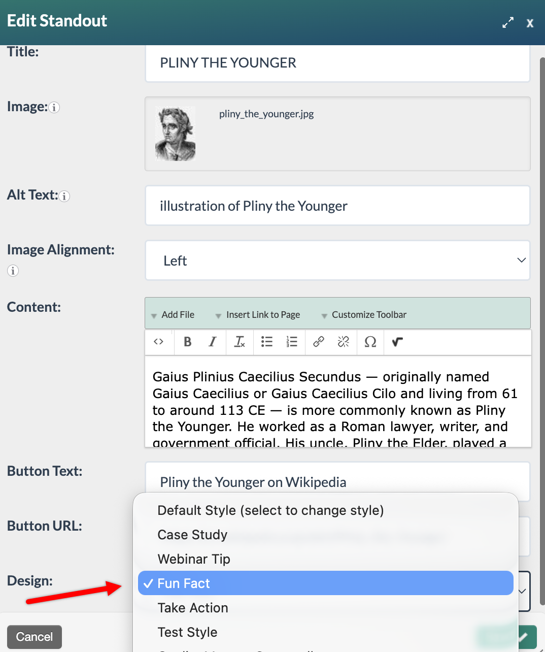
Standout blocks can be customized by configuring standout block classes in the Design Options settings. Once defined, these classes are available for selection from the Standout block's Design: dropdown, allowing the corresponding styling to be applied to the block.
Note: The Design: dropdown will not display when configuring a Standout block unless at least one standout block class has been defined. Only System Administrators and Graphic Designers have access to the Design Options settings.
In the example below, the "Fun Fact" design option is used to change the styling of the Standout block.
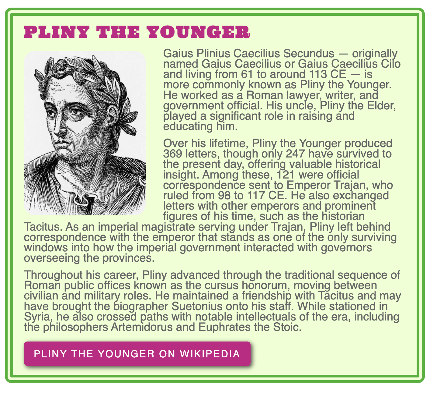
To learn more about customizing the Standout block, refer to the following articles:
Do you have any Standout block and Design Options examples?
How do I customize the Standout block's appearance?
Was this article helpful?
That’s Great!
Thank you for your feedback
Sorry! We couldn't be helpful
Thank you for your feedback
Feedback sent
We appreciate your effort and will try to fix the article