The Standout block allows content creators to draw attention to important information within a course. For example, you can use a Standout block to feature a case study, prompt learner action, identify objectives, highlight required reading, or provide a useful tip. Standout blocks are informational only and are not graded.
System Administrators and Graphic Designers can customize the appearance of Standout blocks by creating or editing standout block classes in Design Options. Once a class is defined, content creators can apply it to a Standout block using the Design dropdown.
Note: The Design dropdown only appears when at least one standout block class has been defined in Design Options.
Customize a Standout Block Class
- Select Design Options from the Settings dropdown. The example below shows the Graphic Designer view.
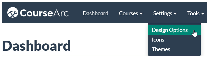
- The Design Options page displays.
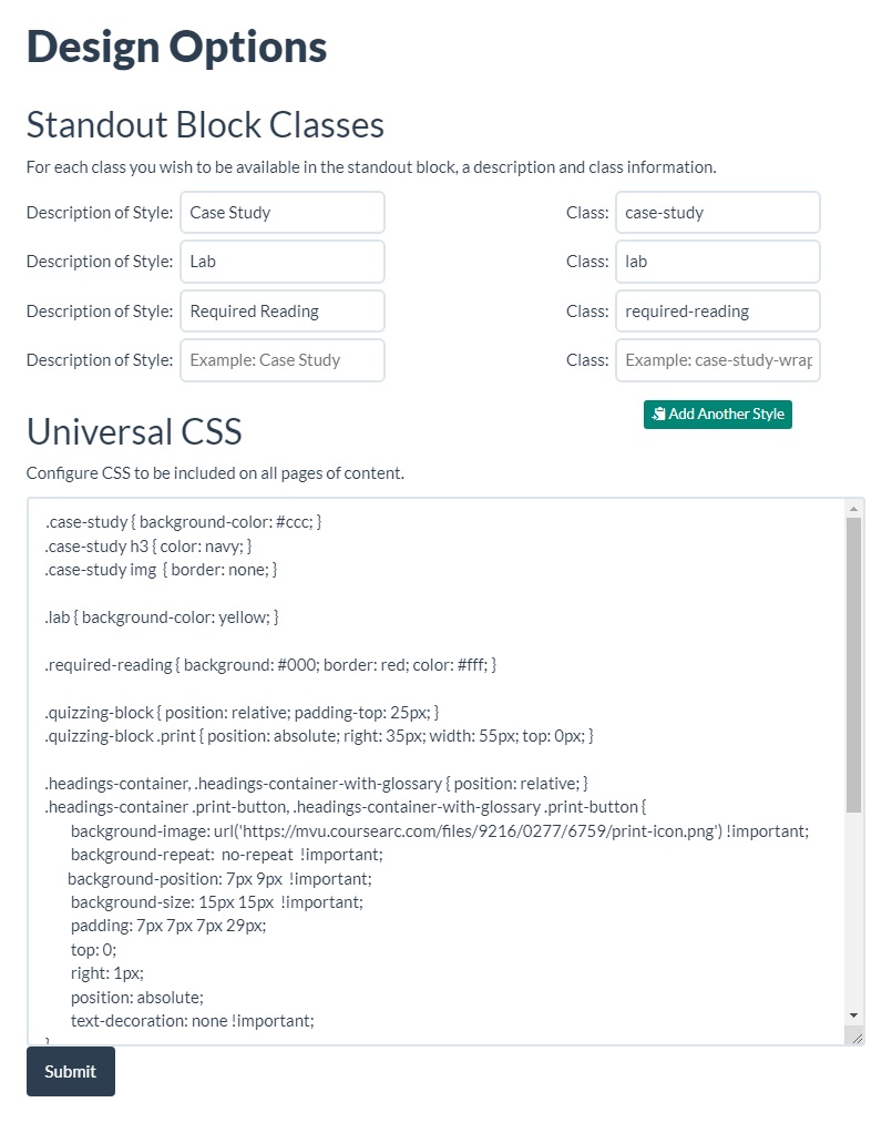 Note: the Add Another Style button will add another row of fields under Standout Block Class.
 - In the Universal CSS field, locate the CSS for the standout block class you want to customize. Edit the existing CSS or add additional CSS as needed.
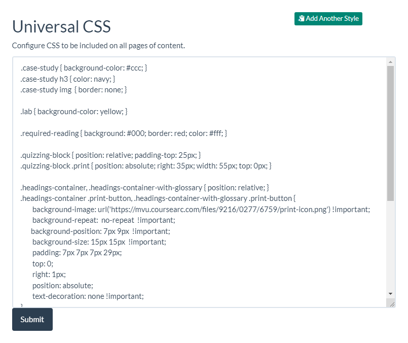
- In this example, the Case Study class is updated to add a border around images. The following CSS:
is changed to:.case-study img { border: none; }.case-study img { border: 5px solid #711; }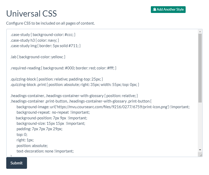
- Click Submit to save the changes.

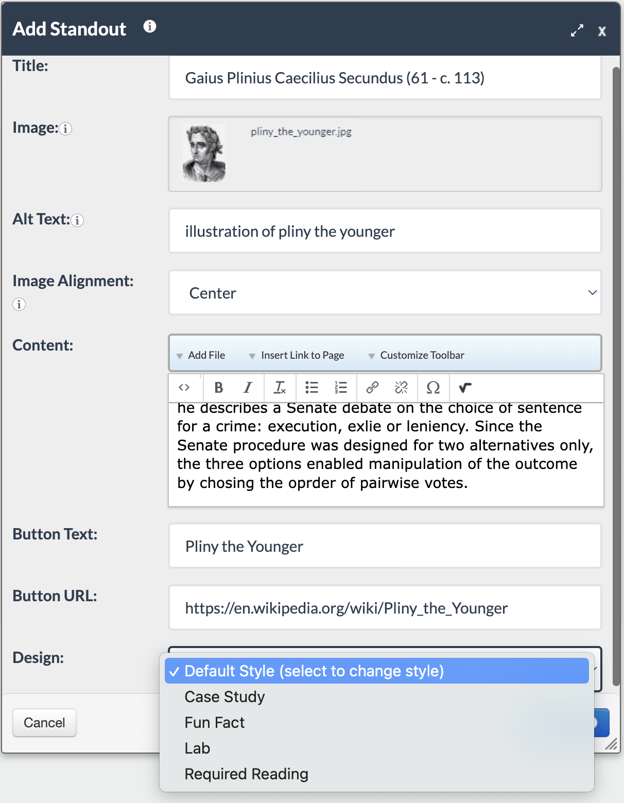
- Once a standout block class has been defined, it will be available from the Design dropdown when configuring a Standout block.
Learn More
- To see customized Standout block examples, refer to Do you have any Standout block and Design Options examples?
- To learn more about the Standout block, check out How do I use the Standout block?
Was this article helpful?
That’s Great!
Thank you for your feedback
Sorry! We couldn't be helpful
Thank you for your feedback
Feedback sent
We appreciate your effort and will try to fix the article