The Interactive Graphs block displays data graphically as a bar graph (horizontal or vertical), line graph, or pie chart.
- Bar – Horizontal: Best for comparing categories across a horizontal axis.
- Bar – Vertical: Best for showing changes over time or ranking items.
- Line: Best for displaying trends over a continuous range, such as time.
- Pie: Best for showing proportions or percentages of a whole.
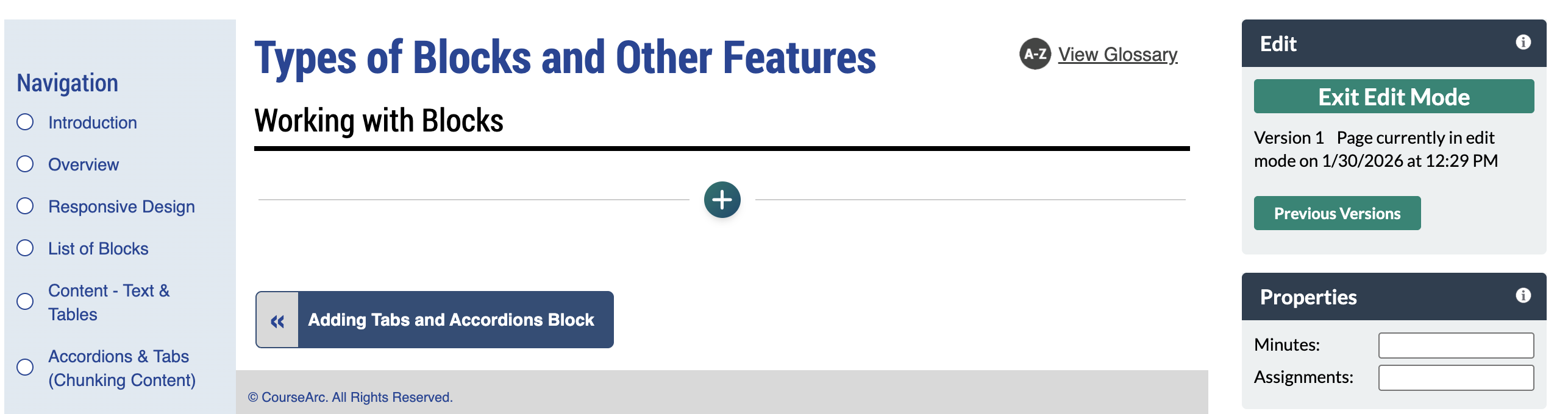
- Navigate to the page and select Edit this Page. Find the position you want to add a block and select the plus (+) icon.
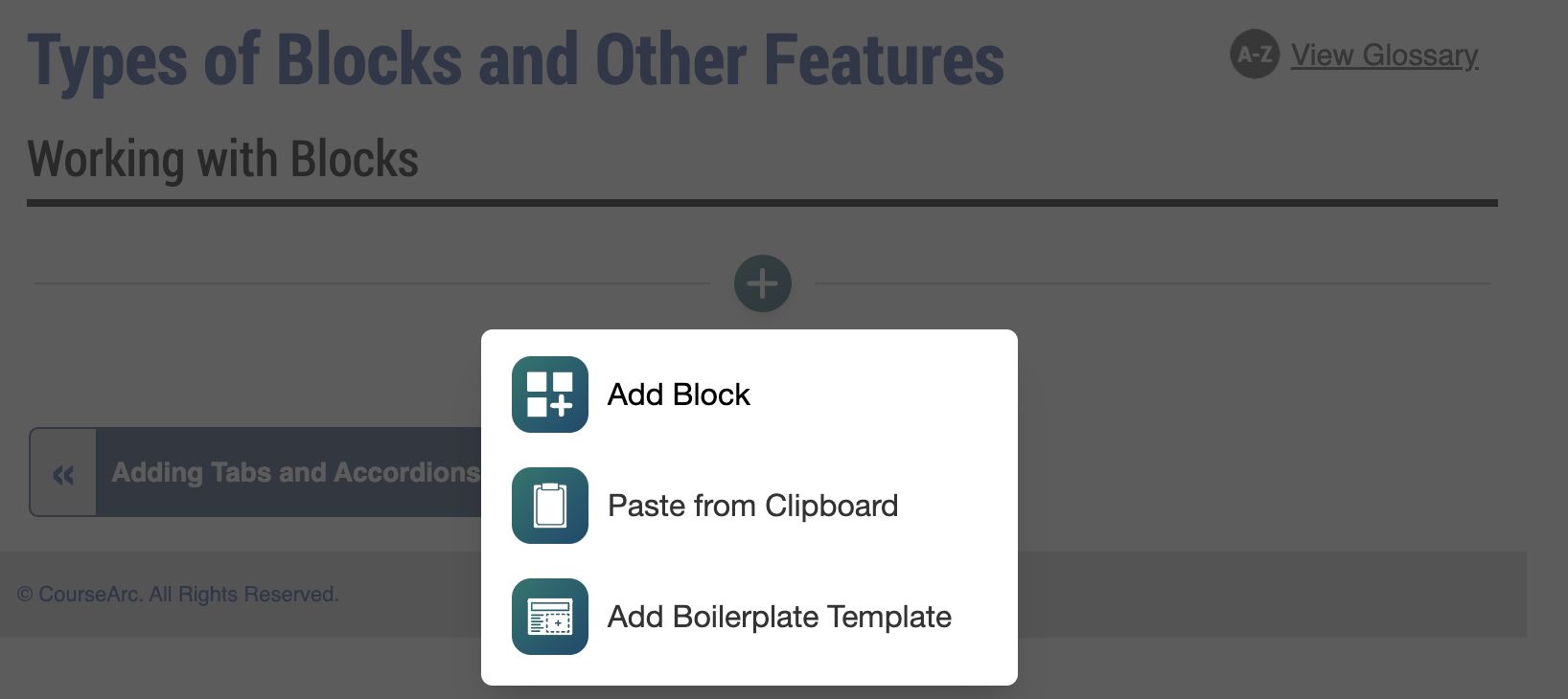
- From the dropdown, select Add Block.
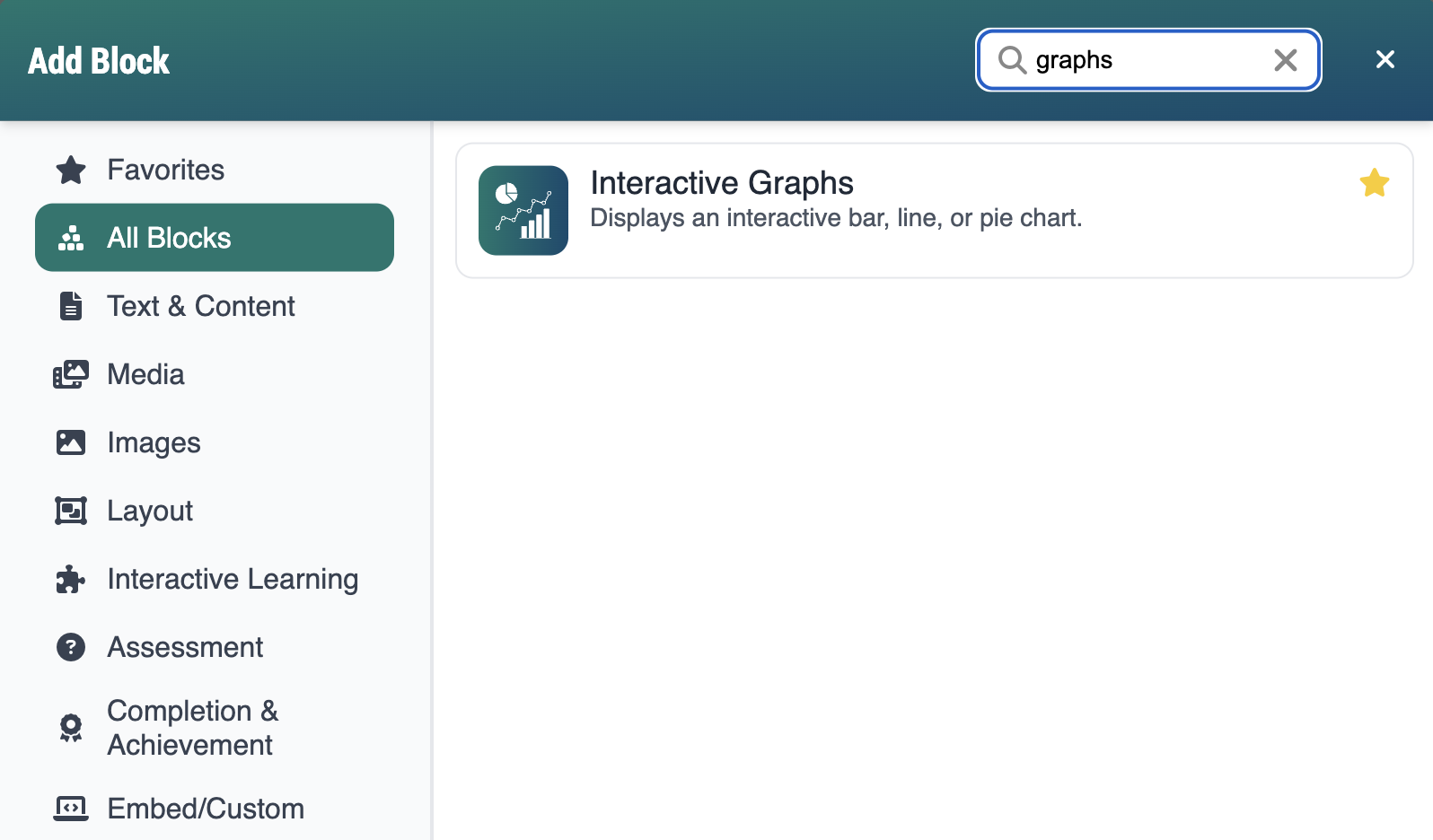
- In the Add Block modal, you can either:
- Use the Search field to find a block by keyword
- Select a block from your custom list of Favorites
- Scroll through the list of All Blocks to select one
- Use the various categories in the side panel to filter by block type
- Select the star icon to add or remove blocks in your Favorites list
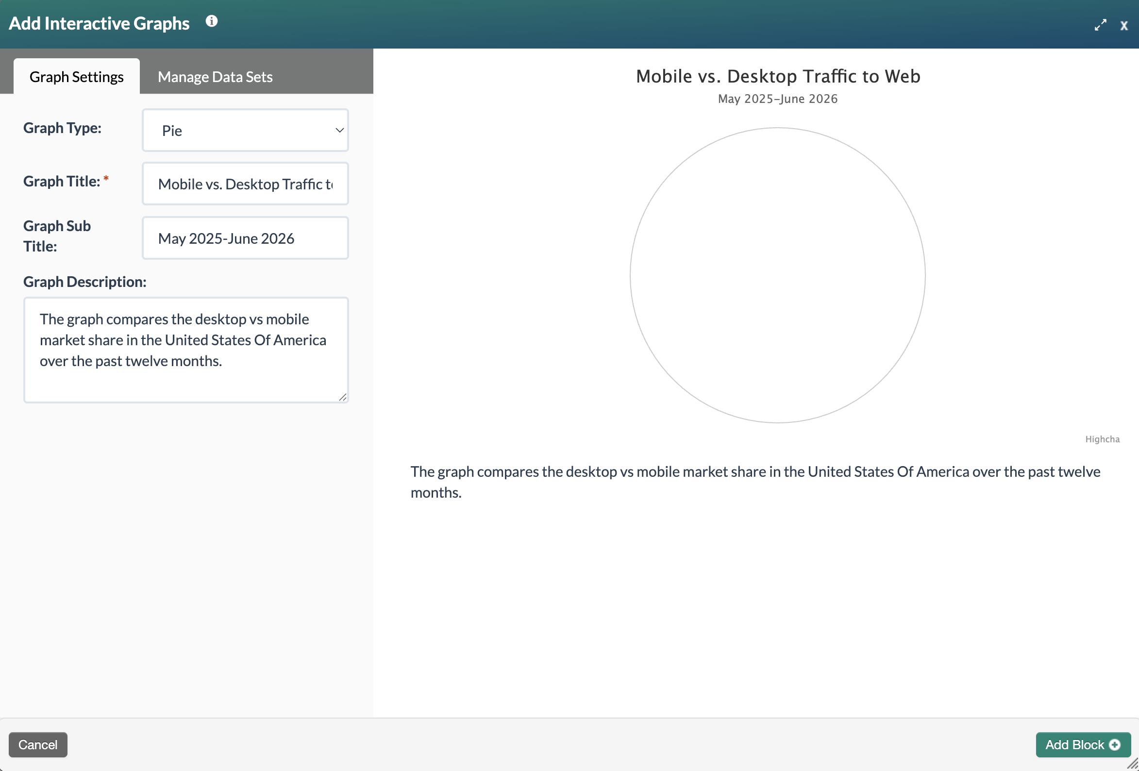
- Select the Interactive Graphs block. The Add Interactive Graphs form will open. The form has two areas: the Editing Pane and the Preview Pane. The Editing Pane is where you configure the image settings. As you make changes, they automatically display in the Preview Pane so you can see how the image will appear as you build it. You can use the toggle button between the panes to collapse the Editing Pane and expand the Preview Pane to full page width. The Editing Pane includes two tabs: Graph Settings and Manage Data Sets.
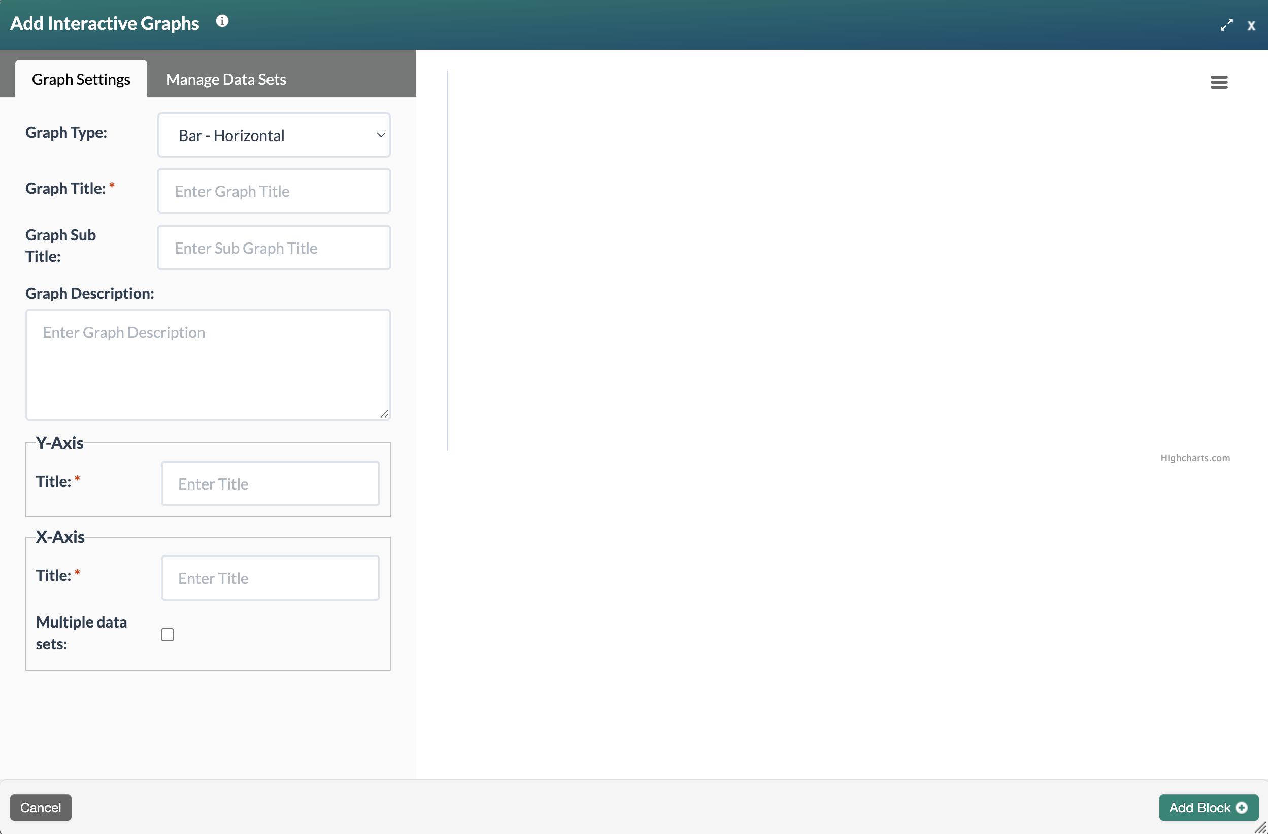
Complete the following fields under the Graph Settings tab to configure your graph:
- Graph Type: Select the type of graph from the dropdown menu: Bar-Horizontal, Bar-Vertical, Line, or Pie.
- Graph Title: The default title is [Insert here]. Enter a clear, descriptive title. Block titles may display in student-facing areas of the course, such as activity names in the Table of Contents.
- Graph Subtitle: Use this field to add supplemental context to support the title, such as a year, data source, or geographic scope (e.g., 2024 Annual Survey Results).
- Graph Description: Provide additional detail about the data, such as notable trends, patterns, or outliers. This field also serves as an accessibility aid for visually impaired learners who may rely on screen readers, so aim for a concise but complete description of what the graph shows.
- Select the Manage Data Sets tab to enter your data points. Enter the Label and Value for your data points. Select the sae button. Repeat until all items have been added. Pie charts must add up to 100 percent.
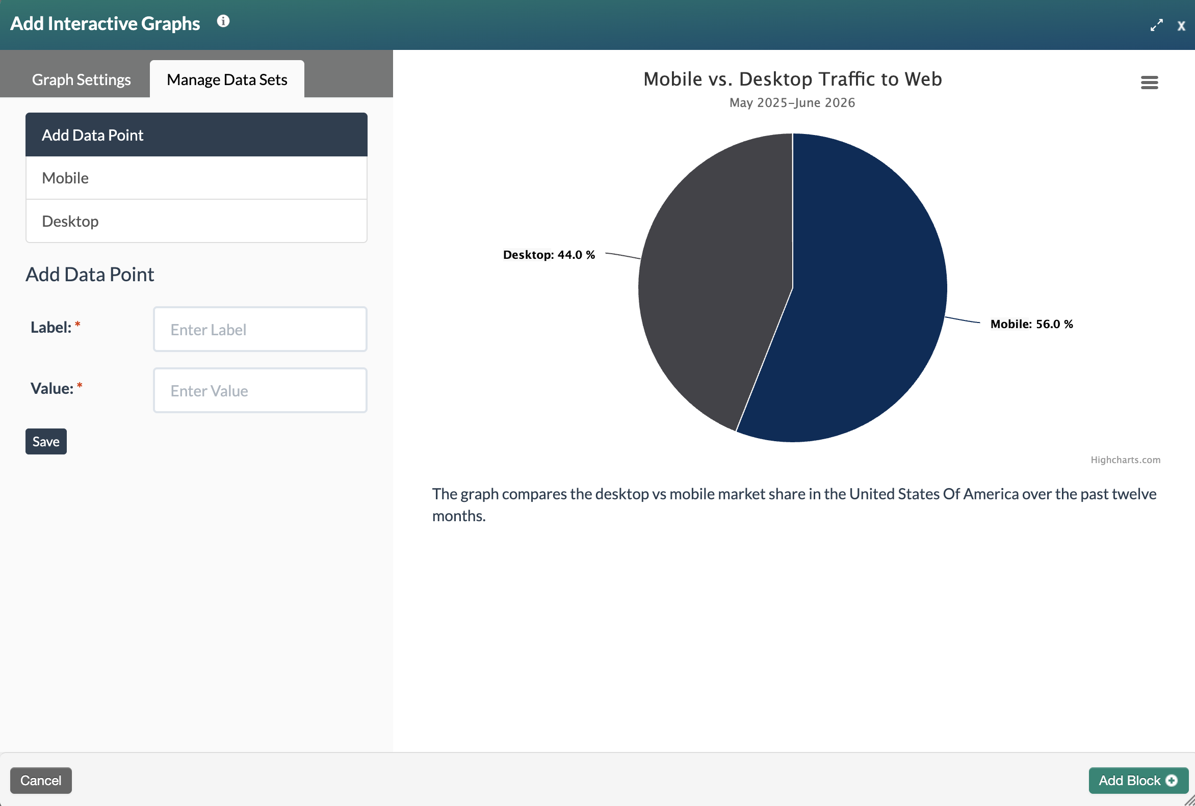
- Once all the required sections have been saved, select the Add Block+ button to save the block to the page.
- The new block will appear on the page in Edit Mode with a red, dotted outline indicating it's editable.
Note: A Graph Data transcript is automatically generated to provide learners with another option for interacting with this activity.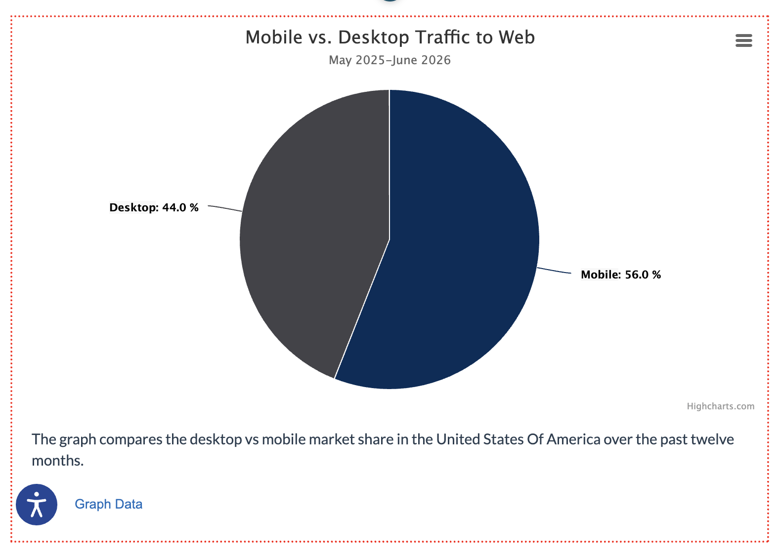
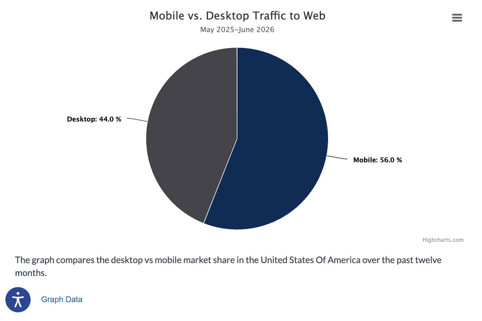
- Select the Publish My Edits button to save the block to the course page and see the content as it will appear to learners.
Multiple Data Sets
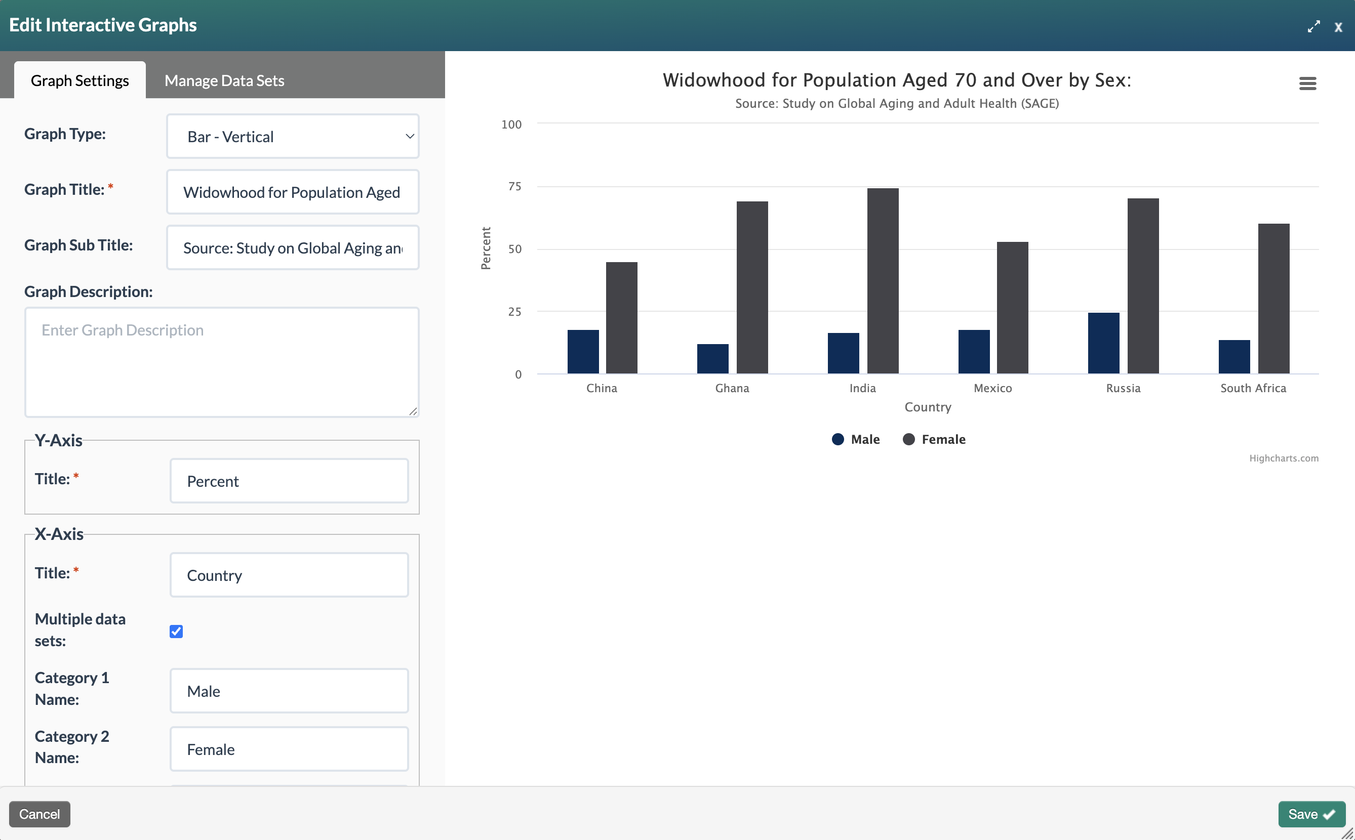
- To display more than one data point per label (for example, male and female life expectancy rates by country), enable the Multiple Data Sets checkbox in the Graph Settings tab. This will reveal additional Category fields where you can name each sub-data group.
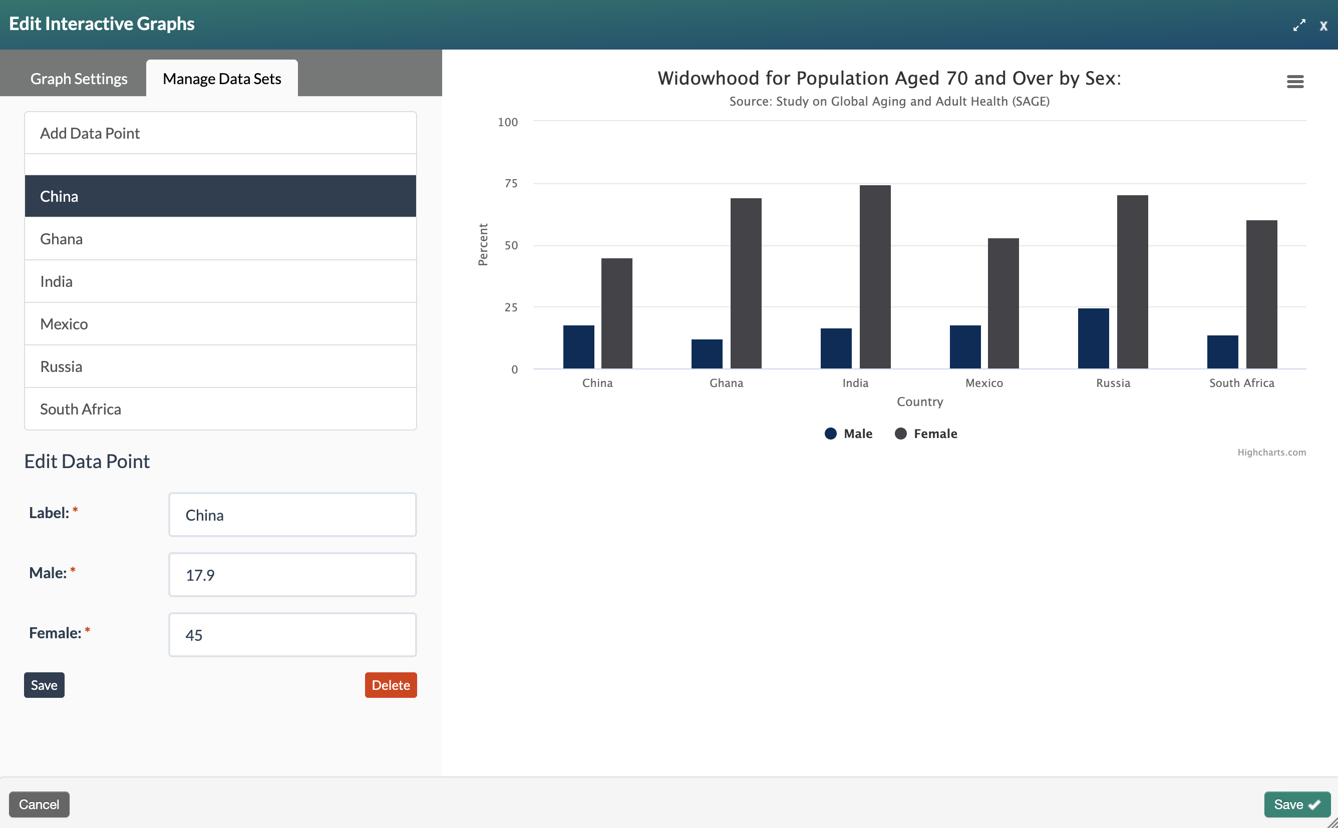
- Select the Manage Data Sets tab to view your categories and enter a value for each one.
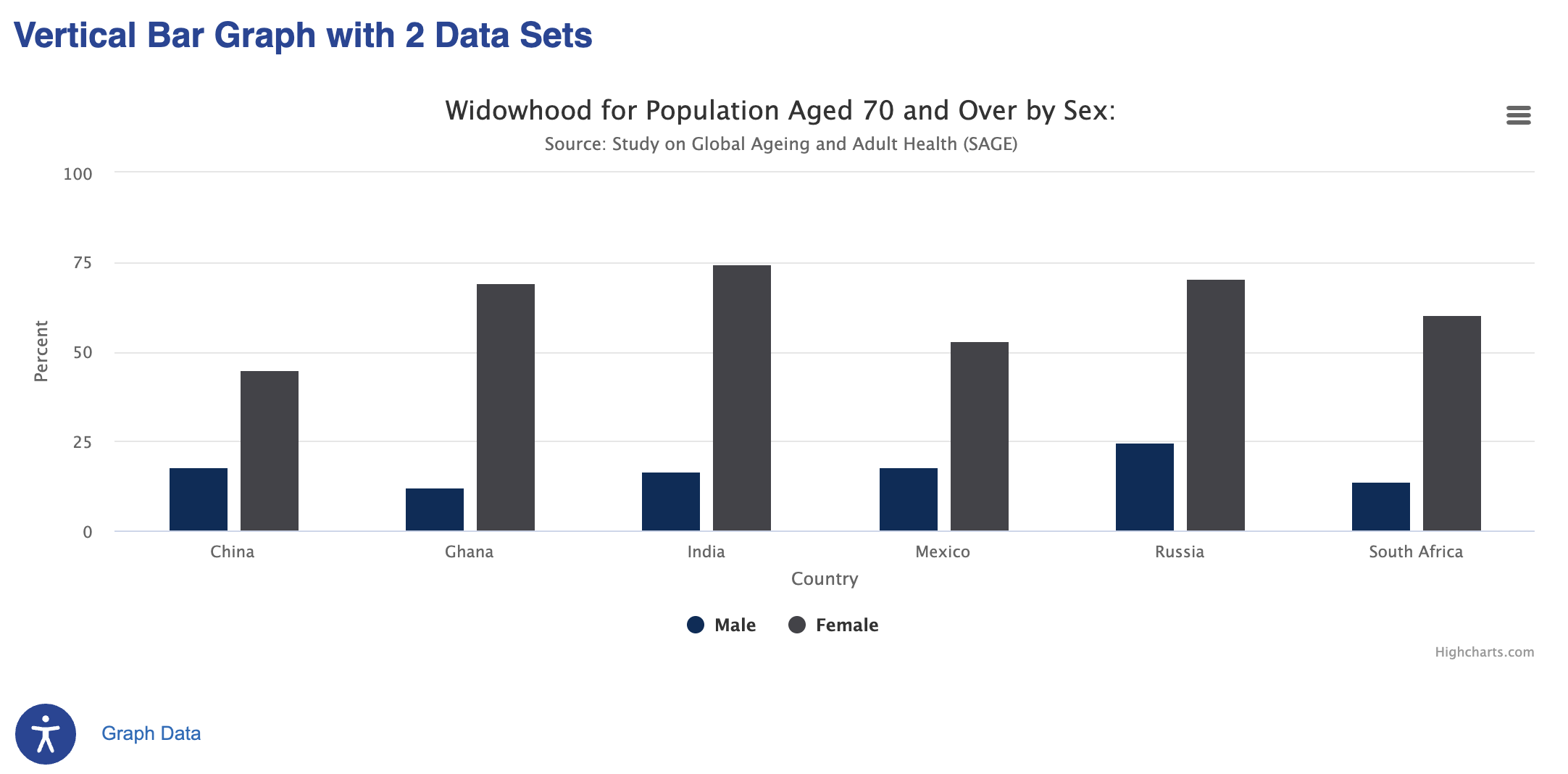 Published view of vertical bar graph with multiple data points
Was this article helpful?
That’s Great!
Thank you for your feedback
Sorry! We couldn't be helpful
Thank you for your feedback
Feedback sent
We appreciate your effort and will try to fix the article